


When Akira was brought over to the States for the first time in '88 by Marvel it was not only an important milestone for manga in English but also an important milestone for comic coloring. Colorist Steve Oliff persuaded Marvel to let him color the series with computers and Akira became the first ongoing comic with computer coloring.
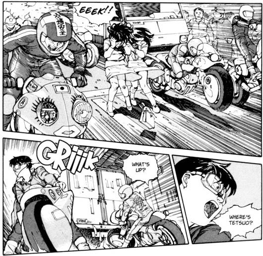
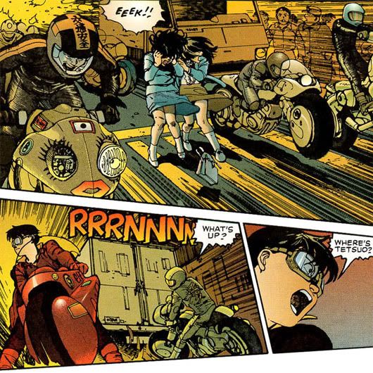
The pale colors makes Neo-Tokyo look even darker but a lot of detail is lost in the process. And even though the color consistency is all over the place I think it looks absolutely delicious. It feels very different from the Akira most of us know, reading it sometimes like reading a new manga. It is not better, just different.
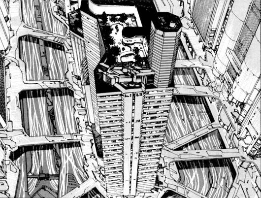
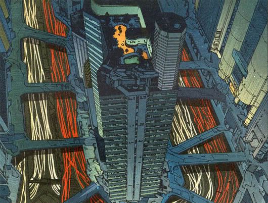
The city vistas loose a lot of detail but gain a lot of oompfh.
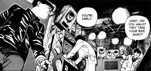
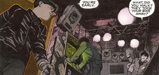
I love the green glow from the arcade.
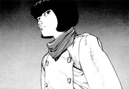
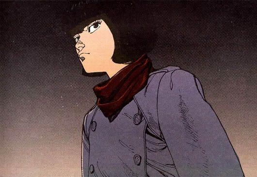
Does Kei look better in purple...
... or beige? Her trench changes color magically. This is my favorite panel from Akira by the way.
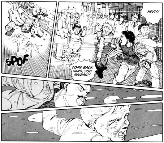
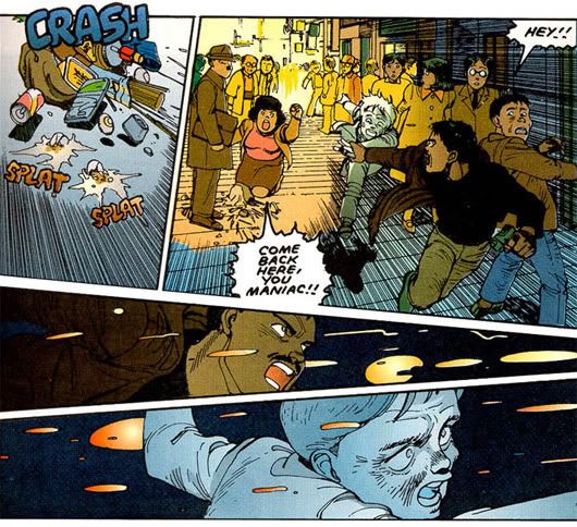
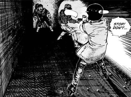
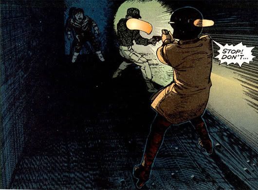
I think the top two panels are worse while the bottom two are better in color.
It is intresting how all the bubbles and onomatopoeia are different as well.
9 comments:
Interesting stuff.
I'm not seeing any loss of detail in the first image as you mention. What I think is happening is that the color distracts one from the incredible attention to detail and perspective. You notice those aspects of the composition less when it's colored. Kudos to the people who colored it, because I don't see any distortion or loss of detail from the original inks.
At the very least, it's not terrible work like the colored version of Hokuto no Ken released by the Japanese themselves. That version mostly utilized blurring and other techniques which annihilated the quality of the original art.
Sorry for the rambling, but this is what comes to mind when I look at those colored Akira pages. Despite their age, the coloring is far better executed than most of the coloring I see in American comics coming out now.
ick no! all those gradients make it look so tame. there's a boldness in the black and white that's lost when it gets the typical "graphic coloring" treatment. otomo was such a good colorist too that i would assume he would do it completely differently and in a way that worked more with his style.
I've always been a big fan of the colored Akira comics, although collecting the entire series in color is an expensive pain, at this point. Oddly, Mandarake shops in Japan often have the entire run (in English, in color) for around 20,000yen, but that makes for some heavy luggage.
I met Steve Oliff at a very small local anime convention, and he had a stack of the original color test prints for sale. I really regret not picking up a few.
Emilio: From what I understand, the Fist of the North Star Master editions were out-sourced to an HK company for coloring.
Sean: You want expensive, try getting Akira in color and hardcover! Now those editions will cost you an arm and a leg at $60 a book.
really enjoyed Oliff's write up about the process behind the work:
http://www.olyoptics.com/test/Timeline1987Page2.htm
i'd say the coloring aged pretty well - the pages seem way more together than the digital coloring in, say, the average Marvel comic published today
Kei's trench doesn't change color. It stays beige. The purple color come from the shadow of whatever surround her. There's still some beige in a fine line, where the light hits Kei (from behind) on the pic you show.
Akira in manga should stay black and white ( except for the few colored pages by Otomo, they really stand out). The colored version is nice at times (really gorgeous toward the end) but the loss of details and the bad layout of the color over the ink draw me to the unaltered version.
That said, I discovered Akira in colored version just before seeing the movie so I still have a fondness for it and I won't put it in the trash. It's there on the shelf next to the original version.
I have the two versions =]
i prefer the black and white. But the onomatopey in the color version is better.
Otomo is a genius!
I think the introduction of color might remove some of the detail like you said, but I think in some frames it actually brings more detail through the contrast. In the first panel you display, I didnt notice the lines of the headlights until color was introduced. Similarly when the spilt groceries page was colorized, it indeed ruined the top panels with weird colors, but I didn't realize the psychic kid was being pulled by the police officer until color was added to contrast the two.
I don't see any loss of detail in comparing or contrasting the two. The only thing being lost when coloring the panel is it's lack of visual interpretation from each individual reader. I liked how you listed the black and white along with the colored pages to show examples of this "difference" you are trying to convey but next time you should explain more on your opinion of how the colored has more impact than to the manga while the black and white is more detailed than just putting the pictures aside one another